Hey lovely – we’re poppin’ bottles over here!
For our latest launch, Janice came to us wanting a beautiful new brand that reflected her individual coaching style and of course, a gorgeous, lead-generating website and blog to start promoting her coaching services.
So if you L-O-V-E calming color palettes, heart-felt words, beautiful page layouts and omg-yes marketing funnels and opt-ins, you’re going to love this one!
Come step inside our virtual studio and see how the magic happens…
Step 1: Logo Design
The very first step in every new brand development is to start by having our clients fill out a “Creative Brief”. This really allows us to understand their unique vision, mission and goals for their new brand and ensure that we not only create a brand that they absolutely love, but that also resonates with and attracts their target audience.
Janice came to us wanting a brand that felt “quiet, calm but strong, with a sense of humor and excitement” for her new life coaching business. We decided to use a succulent in her logo to represent perseverance, which is reflected in the initial three logo concepts we designed. I personally am in love with the watercolor plant designs that add the perfect combination of softness and depth combined with the script font.
Here are the three initial logo concepts + color palettes:
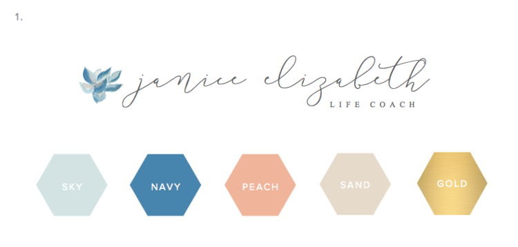
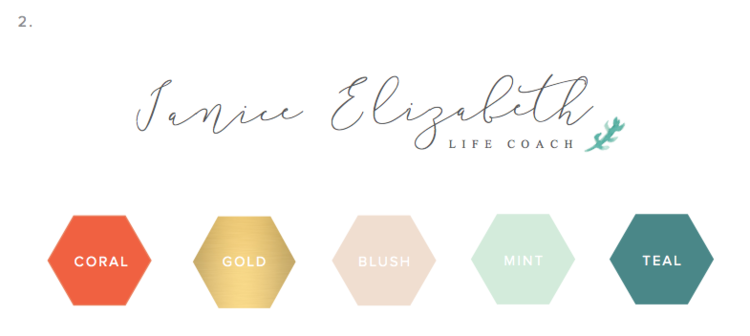
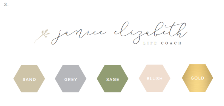
From here, we changed the color of the watercolor succulent (from concept 1) to match the mint + coral color palette (from concept 2). We also went with a sans-serif font for the subtext and increased the letter spacing and stroke of the script font to make it easier to read. You can see the final primary logo design in the Branding Style Board below!
STEP 2: BRANDING STYLE BOARD
The next step is arguably one of my favorites in the entire design process. This is when I take the final primary logo and use it as the foundation to design the rest of the brand including: an alternative logo, favicon, design elements and patterns.
For a life coaching business, I wanted to represent warmth, comfort and welcoming, with a hint of “woo-woo” as Janice likes to say. Our goal was to convey a brand with an underlying sense of confidence, groundedness and excitement.
When I first sent the Branding Style Board to Janice she said, “I am teary-eyed. It is so beautiful and it feels so right.” As a creative, this honestly couldn’t make me any happier!
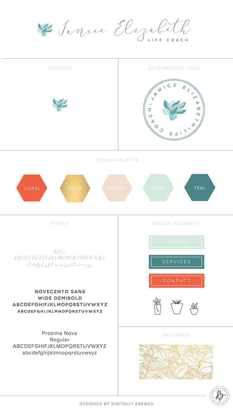
Here’s a breakdown of our design choices for the Branding Style Board –
Color palette: Janice loved the mint + coral combination, with a touch of gold that added a sparkle and shine to the overall brand.
Alternative logo: This version of the logo is perfect for marketing materials that visually require an alternative to the linear logo. This version is also perfect for a Facebook Page profile, Twitter Profile image etc. that must fit within a square.
Favicon: This is the image that shows up next to the title of the website in your browser tab. This version is also great for small profile photos (where text will be too difficult to read) such as the Pinterest profile photo.
Fonts: I chose two complementary font styles that fit very nicely with the script font in the logo. I love the boldness of ” the Novecento” font paired with the simplicity of the “Proxima Nova” font. It’s extremely important that the text on the website is very easy to read and easy on the eye – especially for blogs!
Design Elements: These design elements are a quick preview as to the little graphic elements we added to the website. I love integrating and combining the pops of color for blog sidebar tabs etc. I also designed mini graphic succulents which I think add a touch of personality and whimsicalness.
Patterns: I love this gold foil, leaf pattern that adds to the overall elegance of the brand. We used this sparingly on the website, as to not be overwhelming.
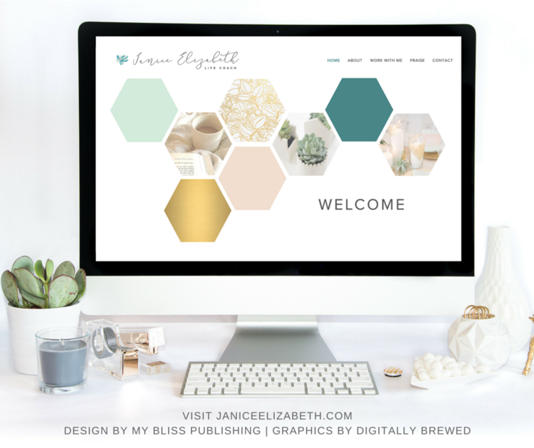
STEP 3: WEBSITE DESIGN
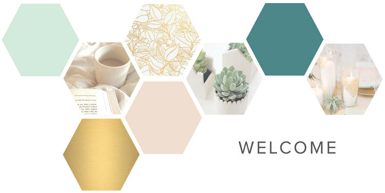
In terms of the overall website design + layout, Janice’s primary goal is to start growing her following before she begins heavily promoting her services. For this reason, our goal was to showcase her free valuable content by making the “Home” page her “Blog” page – to get her readers hooked from the very first blog post!
We also highlighted the free offer as the opt-in (*more details about these in the next section).
Essentially, we setup her website to be a foundation that she can grow with and expand upon in the future into other coaching services, retreats etc.
Janice is also a partner and facilitator for The Desire Map by Danielle LaPorte, which is currently her primary “service” on the Work With Me page.
Throughout the entire site, we focused on bringing out Janice’s fun personality to build a level of trust with her audience.
In terms of design – we designed beautiful custom headers for each page that really add personality and uniqueness to her site. Ah – don’t you just love it?
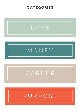
We also designed custom blog category buttons on her blog sidebar for pops of color as well as content dividers with little succulents to add a hint of whimsicalness.
So ridiculously cute…

Overall, we loved combining lots of white space with beautiful graphics. We are absolutely head over heels with the final website, which you can view here!

“I have to say that working with you and Shay has been the most productive, the most clarifying, the most authentically expressing and accomplishing experience I have ever had with a web designer. I have come so far in the time we have been working together and you have given me such professional and intelligent advice.” – Janice
STEP 4: MARKETING FUNNELS
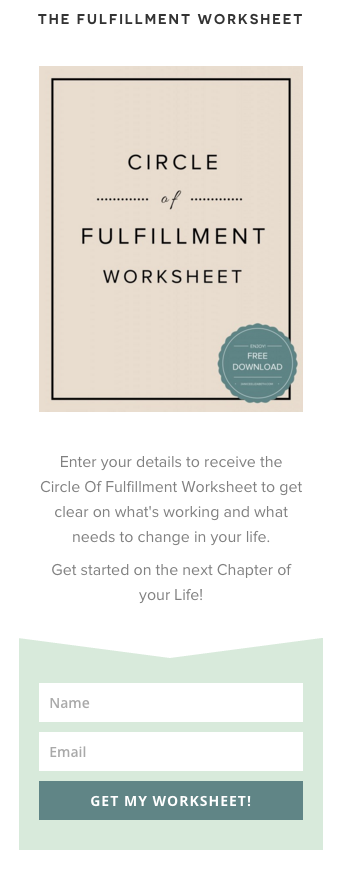
Since Janice’s website is primarily focused on the “blog” page – the main opt-in forms needed to be one of the first items in the blog sidebar on the right hand side. An opt-in is essentially a form to collect emails. In this case, our opt-in is the free offer because it has higher conversion rates – everyone loves free things! (*see image below) A general newsletter opt-in doesn’t usually entice viewers enough to sign up.
For Janice’s email provider – we setup her Mailchimp account, which is one of the most common email service providers (and has a fantastic free version!).
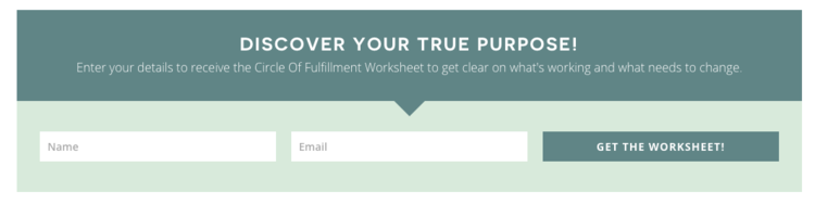
The second most important opt-in is normally placed at the bottom of every page (studies show that viewers read the top & bottom of a page the most). For this reason, we like to have a consistent opt-in form at the bottom of every page.
In terms of call-to-actions (CTA’s = a button or link that drives a viewer to go somewhere or do something) it’s crucial to implement these throughout the site to guide your viewer to where you want them to go (i.e. a sales page, a payment button etc.)
As a rule of thumb, we like to have at least one opt-in and/or call-to-action on each page.
STEP 5: MARKETING MATERIALS
As we discussed in the marketing funnels, we created a “free offer” to grow Janice’s email list. It’s extremely important to provide stellar FREE content to your audience so that it primes them for your AH-mazing paid services.
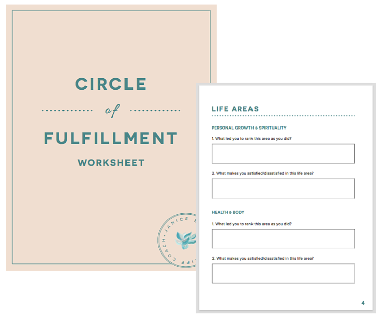
For Janice’s free offer, I designed an interactive PDF worksheet – meaning that it can easily be filled out online! Her “Circle of Fulfillment Worksheet” is an actionable exercise her audience can implement to start getting clear on areas of improvement in their lives.
It’s also extremely important that all materials relating to your business are consistently branded and cohesive.
Overall, this project has been such a joy to work on! We can’t wait to see Janice flourish and thrive in her new coaching business.
If you’re ready to get started with a new business or take your current business to the next level, we’d love to work with you – contact us here.
What was your favorite part about our new website launch? Tell us in the comments below!