Bring out the champagne – today we’re toasting to another launched Blissful Biz Package!
Tina Marcella is a certified personal power and performance coach who helps other online coaches have what she likes to call “The Fabulous Factor”. The Fabulous Factor is the ability to identify and highlight your unique strengths and attributes – whether it’s moving up the corporate ladder, being a superstar public speaker or simply finding the confidence to rock your own coaching business!
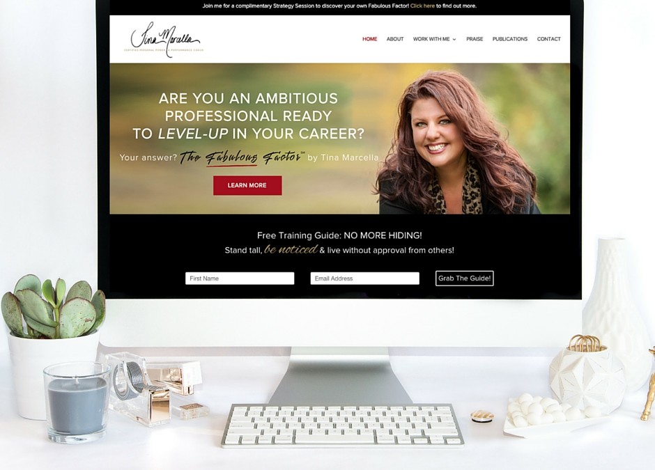
Tina came to us wanting a full branding redesign and a beautiful brand spankin’ new website (the perfect fit for our Blissful Biz Package!)
Today, we’re going to take you behind-the-scenes and show you our entire process from initial logo concepts to final launch of Tina’s gorgeous brand and website.
Let’s get to it!
Step 1: Logo Design
As with every client, our very first step in the process is to fill out our detailed “Creative Brief”, guiding us in a direction and vision for the brand. This allows us insight into what makes your brand unique, details about your target audience, where you draw inspiration from and so much more that are key elements to creating your unique brand.
Based on these answers, we move forward with designing initial logo concepts, which are then refined and finalized to become the primary logo.
Tina expressed that she wanted a brand that felt “energetic, loud and stylish with a rockstar feel (without being grunge!)”
After our brand research and brainstorming, we decided to create her logo as a digitized version of her personal signature, adding to that “rockstar” vibe of her overall brand.
She absolutely loved the final outcome…
Step 2: Branding Style Board
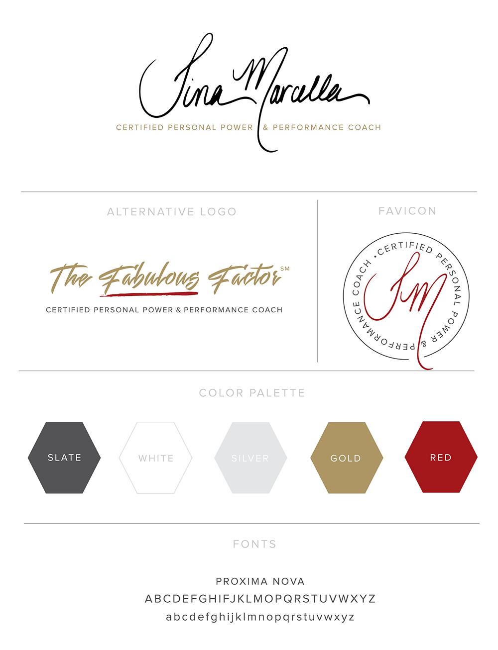
Once we’re head over heels with the primary logo, we use that as the foundation for designing the full Branding Style Board complete with an alternative logo, complementary fonts, patterns etc.
In combination with Tina’s rockstar logo, she loves reds, black and golds – and that’s exactly what we choose for her. It’s extremely important to us that our brands feel authentic and true to our clients!
Step 3: Website Design
In terms of the overall website design + layout, Tina’s primary goal was to drive traffic to her two new services: one on one coaching and a tele-course. Her primary service is her Fabulous Factor one-on-one coaching package. Therefore, this is the primary call to action you’ll see starting from her Home Page and through almost every page. As we wanted to guide the website visitors through her website to ultimately land on her Fabulous Factor one-on-one coaching page. (*more details about the funnel in the next section).
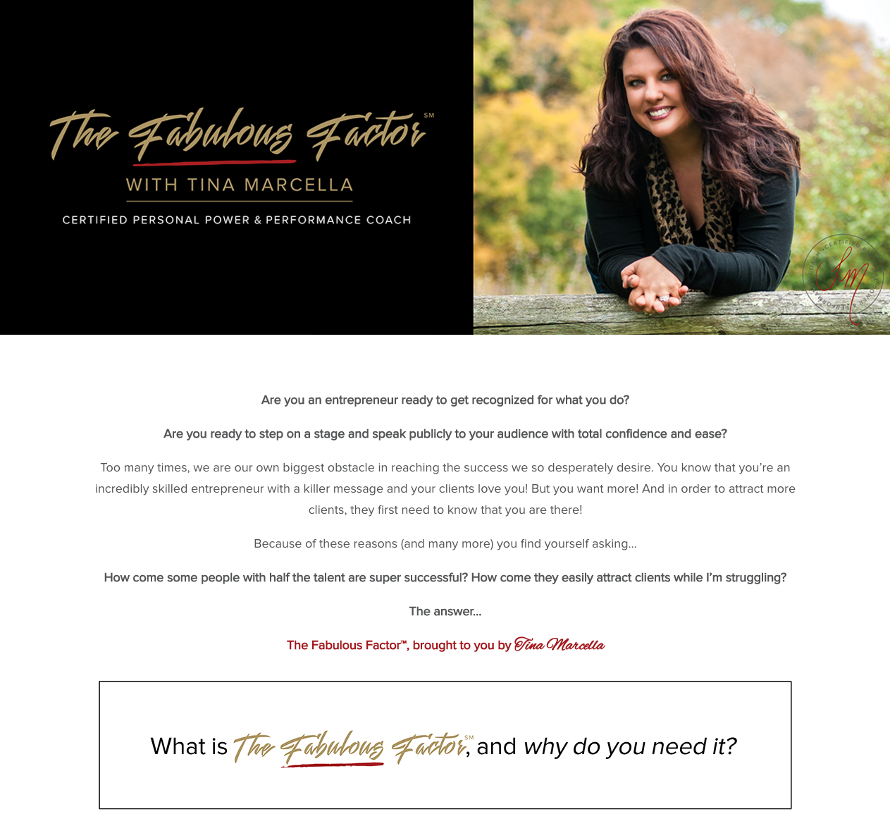
The Fabulous Factor: One-On-One Coaching
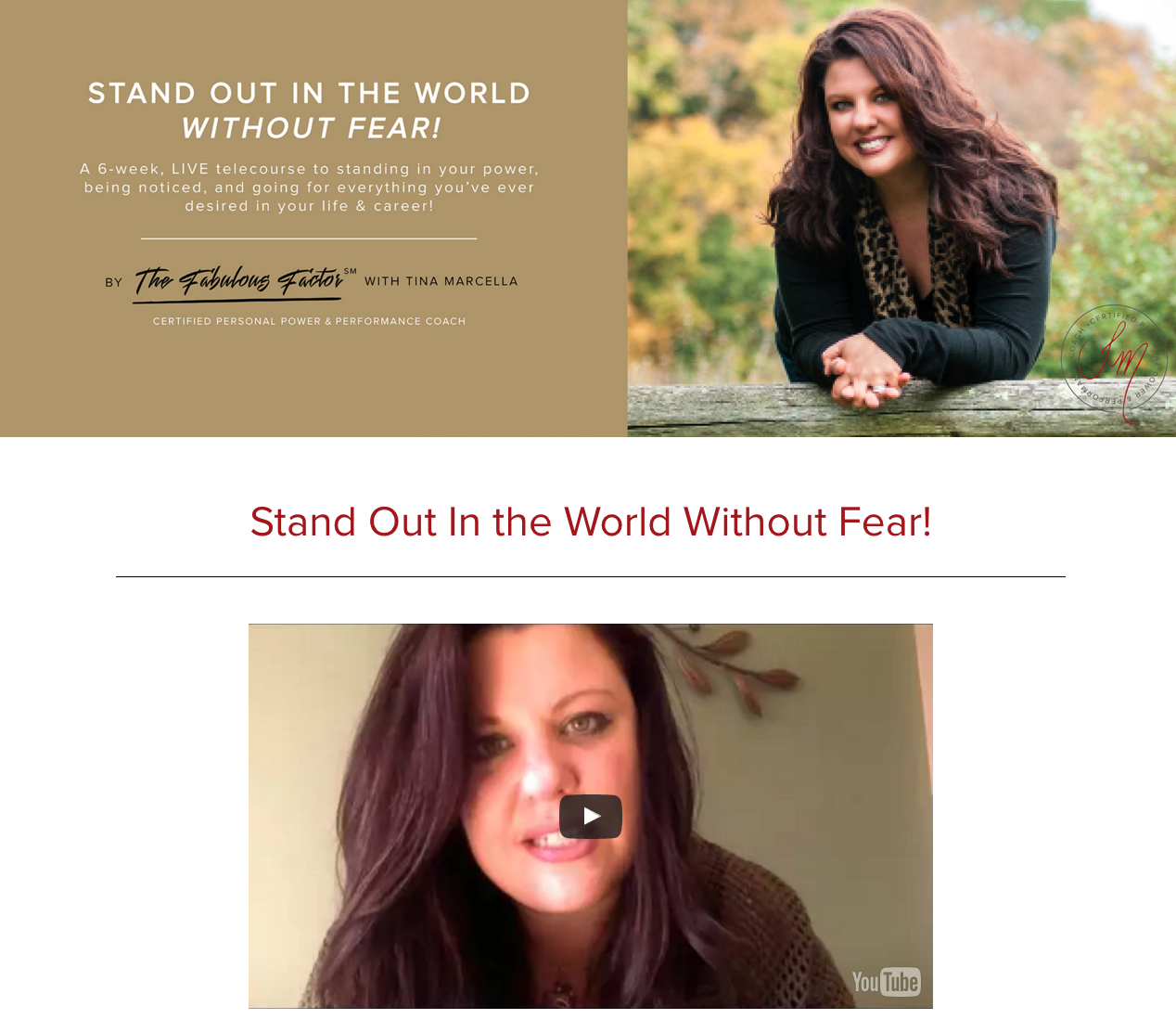
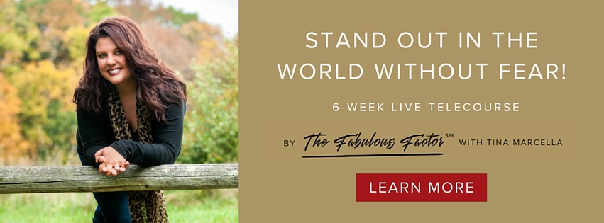
We also strongly highlighted her upcoming tele-course as this was her secondary service offering, we integrated call to actions seamlessly without the website getting an overwhelmed feeling of where should I click. (*more details about the funnel in the next section).
The Fabulous Factor: Stand Out In The World Without Fear Tele-Course
Essentially, we setup her website to be a strong lead generating machine, while still maintaining a get to know Tina feel of the website. Throughout the entire site, we wanted to make sure the website had that brand feel Tina wanted, welcomed the visitors and showcased how Tina was going to help them succeed.
In terms of design – we designed beautiful custom headers for her primary and secondary services (showcased above) and quotes from Tina that really add personality and boldness to her site.
Step 4: Marketing Funnels
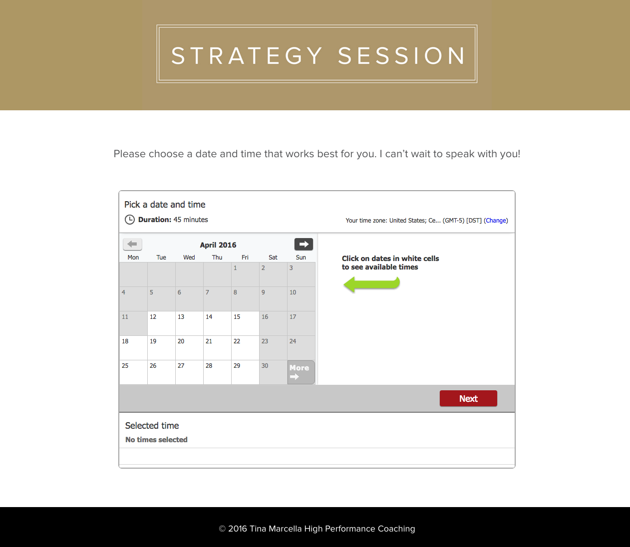
Since Tina’s website is focused primarily on her two services mentioned above – all of the opt-in funnels lead to one of those two service’s sales page. Integrated into the Tele-Course service is a payment gateway where they can purchased immediately, however the One on One coaching service was set up a little differently. For the one on one coaching service Tina has an application process for each prospective client. Therefore, we set up a booking calendar funnel. Instead of sending them directly to the payment page we invite them to book (using an automated and integrated booking calendar) a strategy session with Tina. This is a great way to make sure you and your client are the perfect fit!
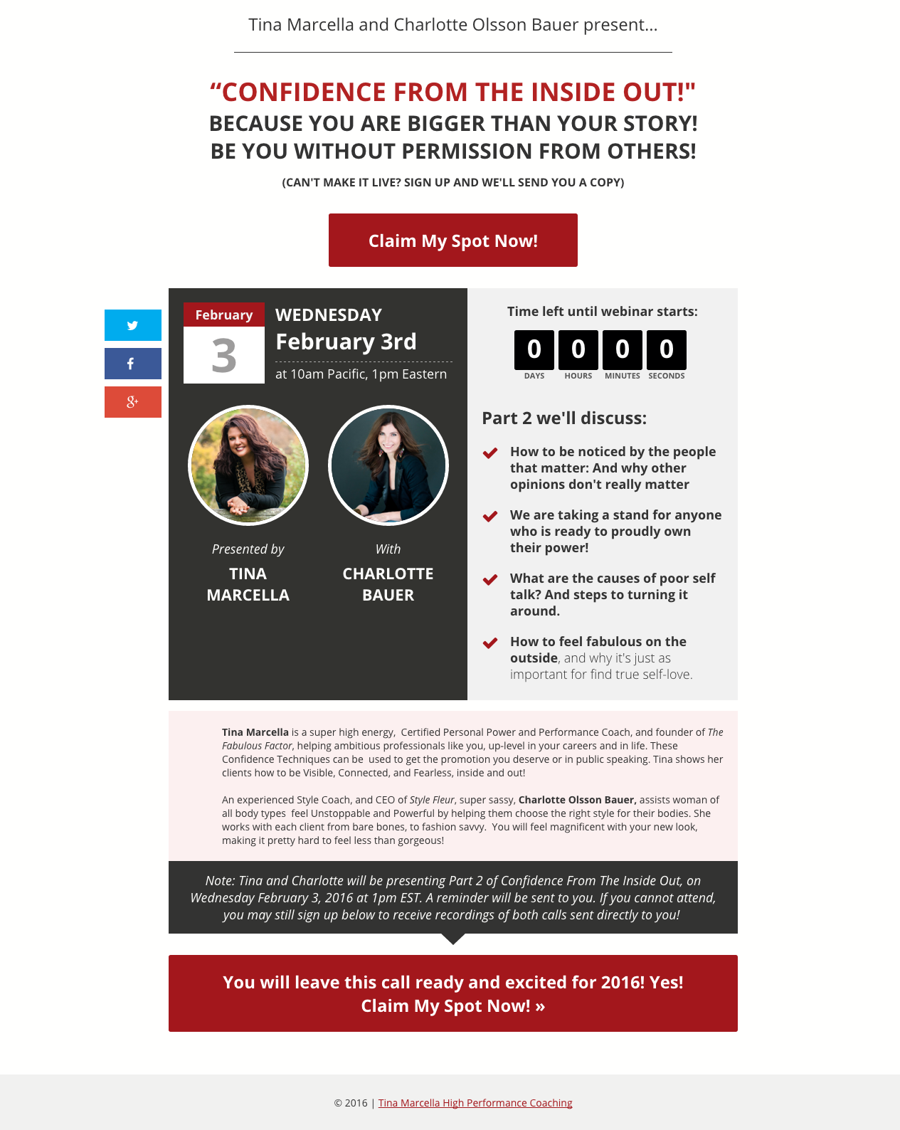
In addition to the main marketing funnels on Tina’s website we also set up a webinar funnel to capture more leads, provide free valuable content AND at the end of the call showcase Tina’s one on one coaching package. This is a great way to build trust with your audience and give them a little taste of your coaching style. We integrated everything from landing page, email capture to setting up the technical bits of the webinar.
Step 5: Marketing Materials
Free Offer
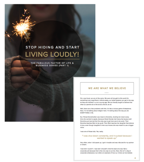
As we’ve discussed previously, it’s a great marketing strategy to have some type of “free offer” on your website to entice your viewers. Tina has an amazing free eBook “No More Hiding! Stand tall, be noticed & live without approval from others” that we designed for her website opt-in.
Social Media Graphics
Along with a beautiful new brand and website should come branded social media headers to give everything a cohesive look.
Webinar Mailer Graphics
As we mentioned previously, we set up a webinar funnel for Tina and along with that comes all of the mailer and promotional graphics too!
Overall this project was an absolute joy to work on and we absolutely love the final outcome! Tina is also a Blissful Biz Management client, an exclusive virtual assistant package reserved for our clients who have purchased the Blissful Biz package.
Congrats to Tina on her big launch (check her out here) and stay tuned for more exciting project launches comin’ your way!

